IELTS Task 1: Bar Graph Description Mastery
Master the art of analyzing patterns, making comparisons, and describing changes across categories
📊 Understanding IELTS Bar Graph Writing
Bar graphs in IELTS Task 1 show comparisons between different categories, often across multiple time periods. Your task is to identify patterns, compare categories, and describe significant changes with precise language.
Task Achievement
Identify main patterns, compare all categories, and highlight significant features
Coherence & Cohesion
Group information logically with clear topic sentences and transitions
Lexical Resource
Use varied vocabulary for comparisons, changes, and category descriptions
Grammatical Range
Employ superlatives, comparatives, and complex structures accurately
📈 Case Study: Economic Sector Changes Over Time
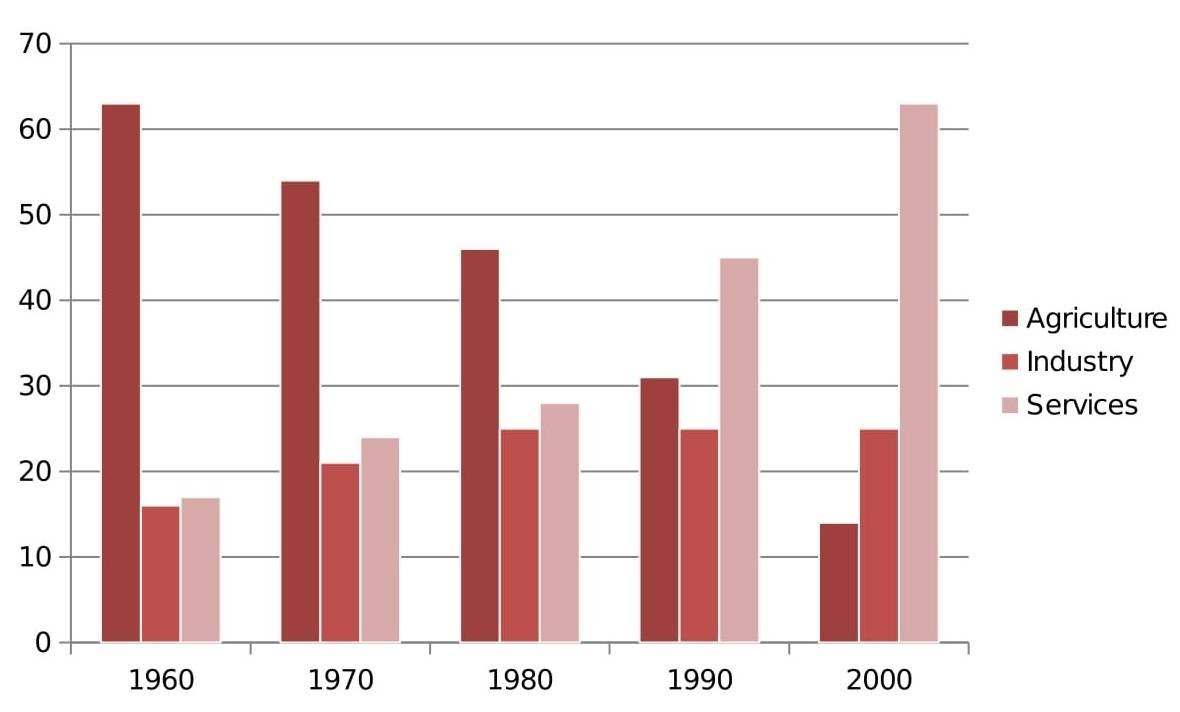
Economic Sector Distribution 1960-2000
This bar graph shows the changing contribution of three economic sectors over four decades.
🔑 Essential Language for Bar Graphs
📊 Making Comparisons
📝 Bar Graph Vocabulary Bank
🔍 Pattern Recognition
"While agriculture showed a dramatic decline from 63% to 14%, services exhibited the opposite trend, rising from 17% to 63%."
"Services overtook agriculture sometime between 1980 and 1990 to become the dominant sector."
"In contrast to the volatility of other sectors, industry maintained a relatively consistent contribution of approximately 25%."
🎯 Exercise 1: Identifying Key Patterns
1. Which sector showed the most dramatic change over the time period?
2. When did services become the dominant economic sector?
3. What can be said about the industry sector across all time periods?
🔄 Exercise 2: Build Comparative Sentences
Drag the components to create accurate comparative statements:
📊 Exercise 3: Complete the Analysis
Fill in the blanks with appropriate language:
1. Agriculture the economy in 1960, approximately 63%.
2. , services showed the trend, rising from 17% to 63%.
3. The most sector was industry, which around 25% throughout the period.
4. Services agriculture to become the sector by 2000.
5. The data reveals a clear shift from a economy to a -based economy.
🏆 Band 9 Model Answer
📖 Examiner's Sample Response
In 1960, agriculture clearly dominated the economy, accounting for approximately 63% of the total, while industry and services contributed significantly smaller proportions of 16% and 17% respectively. However, this pattern underwent a dramatic reversal over the following decades.
By 1970, agriculture had declined to 54%, while both industry and services experienced growth, reaching 21% and 24% respectively. This trend continued through 1980, with agriculture falling further to 46%, industry rising to 25%, and services climbing to 28%.
The most significant transformation occurred between 1990 and 2000. Services overtook agriculture to become the dominant sector, soaring from 45% to 63%, while agriculture plummeted to just 14%. Notably, industry remained the most stable sector throughout the entire period, fluctuating only slightly around 25%.
Word count: 198 words | Band Score: 9
✍️ Your Turn: Write Your Analysis
Task: Write your own 150+ word analysis of the economic sectors bar graph. Focus on overall patterns, key comparisons, and significant changes across the time periods.
🎓 Key Takeaways
📊 Group Logically
Organize by time periods or categories for clear comparisons
🔍 Find Patterns
Identify trends, crossovers, and inverse relationships
📈 Use Comparatives
Employ superlatives, comparatives, and ranking language
💯 Support with Data
Include specific percentages and figures for credibility